The Making of


Role:
• Concept
• UI/UX Design
• Illustration
• Branding
• iOS Development
Tools:
• Figma
• SwiftUI
• Canva
• Xcode
• Claude
Platform:
• iPhone
• Home Screen Widgets
Scope:
• 2 Themes
• Light & Dark
• 4 Wellness Categories
• 100+ Tasks
• 10 Achievement Groups
Status:
• In Development
• Coming to App Store
Jump To:
Bearings celebrates whatever you accomplish, with zero downside for what you don't.
Sometimes you set out with the best intentions to get a lot done, and before you know it, you’re overwhelmed with where to start. So you end up not finishing anything.
It doesn’t matter where you start, because even one thing a day matters. For many people, that one thing isn’t small. Showering, caring for your pets, or taking out the trash all take real time and energy, and they deserve to be acknowledged.
Instead of piling on more tasks that leave you feeling behind, Bearings keeps track of what you’ve already done. Whether you live with ADHD, anxiety, depression, or just find everyday tasks difficult some days, Bearings meets you where you are.

Bearings gives you a space to record all the small things, with tools to categorize them and look back on them over time. Every part of it was designed around a few simple principles:
-
No guilt. There are no streaks to break, no reminders, and no punishment for an off day. Achievements are cumulative totals, so nothing you’ve earned is ever lost.
-
Nothing is asked of you. Barry, the app’s resident bear, is a companion, not a pet. You never have to feed him, level him up, or keep him happy. He’s not a coach pushing you to do more, just a steady presence reminding you that showing up, in whatever form that takes, is enough.
-
Low mental load. Color coded categories and simple visual summaries give you a clear picture of how much space everyday tasks take up in your life. Milestones use round, easy to read numbers (5, 10, 25…) so celebrating is effortless.
-
No barriers. Bearings is free, with no ads, no subscriptions, and no in-app purchases.
These ideas became the foundation for everything that followed. Here’s how the design took shape.
The app started out with the name Basics, because the small tasks that take up so much of our lives are basic necessities, much like the “bare necessities” or the “bare minimum.” That idea of “bear” led to Barry, an emotional support friend within the app. Eventually the name was changed to “Bearings”, representing a method of finding your way, one step at a time.
Since the bear theme would carry through so many elements, it became natural, simple imagery for the icon and logo. The app icon plays with the shape of a bear’s head and the outline of a B, which also anchors the full logo.
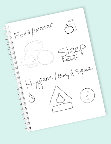
The categories came from looking at the essential wellness tasks most people face every day, like eating, showering, taking out the trash, and cleaning the home, as well as spending time with others and finding moments for exercise. Since the categories are the heart of the app, they shaped the core design of the home page and the navigation throughout.

The tasks within each category are written in the past tense, so there’s no pressure to do something in the future. Each item can be logged multiple times a day, or added to a past day if a user forgets to log it. Users can also create their own tasks or hide the built-in ones.
As the two themes developed, clouds and stars replaced the category grid in the Bearings theme, and a small cabin was added to give Barry a place to live. All of the elements are vector-based, so they can be reused and adapted as the app grows.


A short inspirational message appears in the smoke rising from the cabin chimney, drawn from a set of messages that rotate daily. The same message also appears on the Home Screen widget, for users who choose to add it.


Since bears live in the woods, the main Bearings theme became a wooded mountain scene. That landscape also shaped the design of the launch screen, which appears whenever the app starts up fresh, whether it’s opened for the first time or reopened after being fully closed.
If users add the widget to their Home screen while using the Bearings theme, it shows the same landscape and matches the chosen light or dark mode setting.
Small details like the compass star are a nod to the name “Bearings”: they’re meant to guide you and help you find your way.


The compass star also inspired the widget design for the Basic theme. This version leans into a calm, meditative style, with the star as the main focus. Its colors are a blend of the four category colors, mixed together in soft gradients.
To create small moments of celebration without forcing streaks or goals, a pop-up appears whenever a milestone number of tasks has been completed.
Its design returns once again to the compass star, as a small reminder of guidance along the way.


The stars were combined in different ways to create icons for an Achievement page, with unique sets for the Basic or Bearings theme.
Icons from Apple’s SF Symbols add finishing details that set each Achievement category apart.
The different star combinations were then brought together to create a fully illustrated compass. Behind it, the celebration pop-up blends the light and dark themes, with misty mountain peaks below and stars twinkling in the sky above.

Ten Achievement groups were created for launch, each drawing on tasks from multiple categories. For example, an Achievement for caring for others combines tasks from the Nourish, Cleanse and Restore categories, such as Fed Pets, Emptied Litter Box, or Played with the Kids. A celebration appears each time users reach a combined total of 5, 10, 25, 50, 100, and so on.
Some individual tasks are tracked as well. If the user has taken out the trash or recycling many times, that total is saved for them to look back on. All achievements can be found in the Summary tab.


The Summary Tab was designed as a visual tool, illustrating the weight of accomplishment through color and space. In the Basic theme, a classic chart displays the four categories and tallies the tasks completed within the selected time frame.
To bring the same idea into the natural style of the Bearings theme, several versions of the chart were explored to capture how much space small tasks take up. In the end, a chart illustrated as a lily pad proved the best fit: it shows the information clearly while creating a calm moment to reflect on how far users have come.
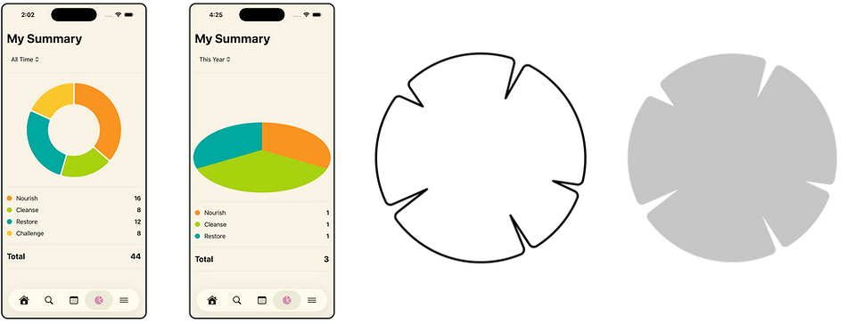
In the first iteration, the pie chart was tilted on its axis to create the illusion of looking out across a pond, so the chart itself could become a lily pad. A general lily pad shape was drawn and then applied in the code as a mask over the chart.
New category colors were developed for the Bearings theme, giving easy to read contrast against both the light and dark versions of the pond.


Ultimately, tilting the chart on its side made the data harder to read, and the angled view of the pond became a distraction rather than a relaxing background. Switching to a view that looked straight down on the lily pad kept the chart clear and legible, with small details added to suggest watery depths.
When nothing has been logged for the day, a shadowy cluster of lily pads appears beneath the water. In the surrounding scene, highlights in the category colors reflect on the edges of small lily pads and tie everything together.

The Summary includes a time range drop-down so users can see how their categories have progressed over time. If tasks within the Cleanse category have taken up a significant portion of multiple days, a user might decide to set aside more time for relaxation or for things that restore their wellbeing.
The tool is purely visual and a way to record data, but users decide how to interpret that information and what is most important to them. With Bearings, there is no pressure to be doing anything. It's a place to recognize what's been accomplished over time. Some days you may not be able to complete anything, but that doesn’t take away from everything that came before.


Each day on the calendar can be selected to see a detailed view of completed tasks. If users forget to log something, they can add it afterward through a separate menu organized by category.
Tasks can’t be added to future days, which keeps the app true to its purpose as a “done list” rather than a planner. Custom tasks that users have created in each category also appear in this Add a Missed Item menu.


Ending where it all began, Barry is the little cheerleader of Bearings.
Since Barry was meant to be a supportive character, he was given a small, unobtrusive corner on the Home page, where he can keep users company without competing for their attention. Barry isn’t a nurturing mechanic that needs to be fed, leveled up, or cared for; he is unconditionally there for support.
Barry also has his own page, where users can get to know him and the app a little better, along with a reminder that everyone struggles sometimes and no one is alone.


Barry’s design started with simple shapes that could be vectorized for future images or animations. These shapes can be easily adjusted and rearranged.
As the illustrative style developed, a stylized stroke was added around the shapes to create a hand-drawn effect. The same stroke appears on other artwork throughout the app, keeping the look consistent.
In the final design, small touches of shading and detail give Barry a more three-dimensional feel, and the shape of his muzzle echoes the B in the app icon.


In the Bearings theme, Barry is part of his forest habitat, sitting beside the lily pad pond against a misty backdrop, with pine trees in the distance.
In the Basic theme, Barry is sleek and modern to match the bold shapes and colors of the Home page, with just as much personality.
Each version of Barry matches the user’s theme choice. As the app continues to evolve, future updates may bring new features for Barry, including animations built with Lottie.


Videos and iPhone mockups were made in Canva.
Bearings is a real, working app, designed and illustrated in Figma and built natively with Apple’s SwiftUI framework. It’s currently in development and will be available on the App Store soon.
Built With
SwiftUI · SwiftData · Swift Charts · WidgetKit · CloudKit (iCloud sync)
Technical Highlights
-
Privacy by Design: There are no accounts, servers, or analytics. Data stays on the device or in the user’s own iCloud. The app includes Apple’s required privacy manifest and encryption declaration.
-
iCloud Sync With a Safety Net: Data syncs across devices through CloudKit. If storage fails at launch, the app falls back to local-only, then temporary storage, with an alert, so users aren't stuck at startup. iCloud sync was tested between a physical iPhone and the simulator before the CloudKit schema was deployed to production.
-
Two Themes, One Codebase: Major screens have separate Basic and Bearings views for full design freedom, while shared logic like achievements and daily messages live in common files.
-
Built-In Content at Scale: Over 100 built-in tasks across four categories, plus custom tasks, global search, and swipe actions to Hide, Edit, or Delete.
-
Native Tab Bar Styling: A small UIKit bridge (TabBarAccessor) recolors the tab bar in place to match each theme. An earlier workaround reset users’ place in the app, and this approach avoids it.
-
Custom Masked Charts: The lily pad Summary chart uses Swift Charts with an illustrated shape applied as a mask in code, so the data stays accurate while the art stays hand-drawn.
-
Self Correcting Achievements: Tasks within the Achievement Groups begin calculating from first use. Totals count in both directions, so deleting an entry updates achievements automatically.
-
A Widget That Matches the App: The small and medium Home Screen widgets read the user’s theme and light or dark mode, and refresh daily with inspirational messages shared between the app and widget.
Accessibility
Accessibility was considered throughout the development process, with a plain theme alternative, a haptics toggle, legibility checks in light and dark modes, round milestone numbers, and testing on an older iPhone to make sure the app runs well beyond the newest devices.
How AI Was Used
The concept, design, illustration, and every product decision were made by people. AI served as a development collaborator, helping to draft and debug code, research SwiftData and CloudKit, review documentation, and write first drafts of copy that the team then edited before publishing. For example, an AI code review near the end of development caught that the widget and the app were set to different minimum iOS versions. It also flagged a startup error that could have trapped users at launch, which led to the fallback system described above.
Next Steps
Bearings is in final pre-release testing ahead of its App Store launch. Future updates may include animations for Barry, an Achievement timeline, custom categories, and a user controlled data export.